Keystack staging is one broken theme away from looking finished.
Khoa's right that it looks rough — but it's not dozens of unrelated bugs. Almost everything traces to one root cause: the signed-in app runs on the dark "EmuBrain" family theme, but the content (headings, body, labels, form controls, buttons) is still colored for a light background — so text renders dark-on-dark and is barely legible on every surface. Fix the theme's colour contract and ~80% of the "ugly" disappears at once. This is the same move as the Catalogue panel: find the systemic cause, not just the symptoms.
The one finding that matters
P0 · App-wide unreadable text on the dark theme
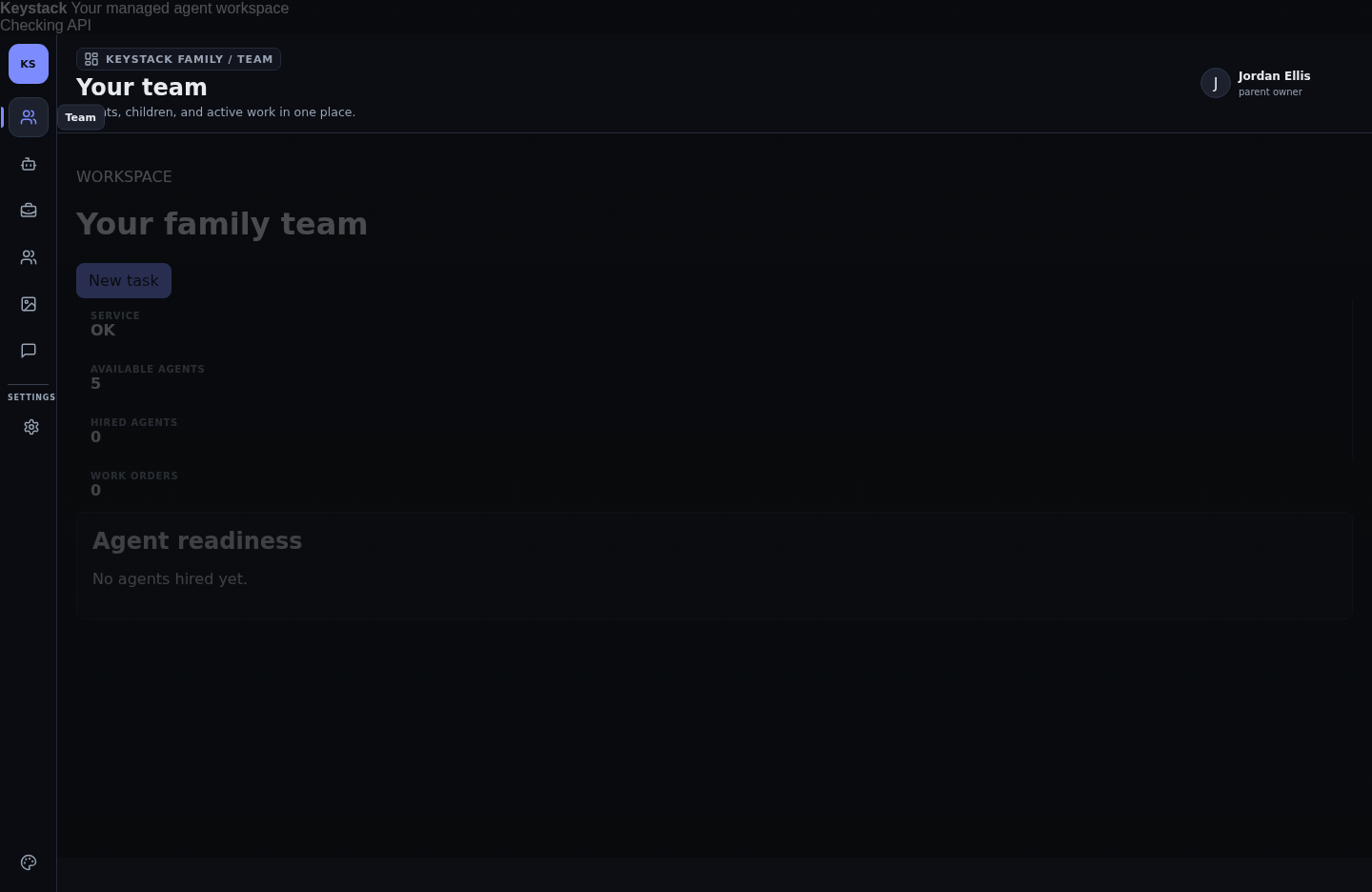
What happens: the authed shell renders on a near-black background (the "EmuBrain" family theme), but headings, body copy, metric labels/values, form fields and buttons keep their light-theme dark colours — e.g. dark-grey text on #0d0f12. The result is dark-on-dark across the whole app: "Your family team", the metric numbers, "Agent readiness", the Catalogue card copy, the Account settings — all present, all nearly invisible. Only the agent photos and the top-right user chip read.
Why it's systemic: it's not per-page — it's the theme's colour tokens. The dark theme flips the background but not the text / surface / border / control tokens (or the theme was designed to sit on a background image — note the Account page's "Readability overlay" slider — and with no image the text has nothing to sit on). Either way the contrast floor is missing.
The fix (one contract, applied once): give the theme system a real light+dark token pair — --tx/--tx-muted/--surface/--line/--control-bg — and make the dark theme redefine all of them, not just the background. Every heading/label/input/button must read from tokens, never hardcoded hexes. Guarantee WCAG AA (4.5:1) for body text and controls on the themed background, and make the "Readability overlay" enforce a minimum contrast floor so a background image can never push text below AA. Ship the default theme already readable.
The evidence (every surface, same failure)
Team / Overview — the landing page is unreadable
Account / Appearance — the theme control itself, and the fields, are invisible
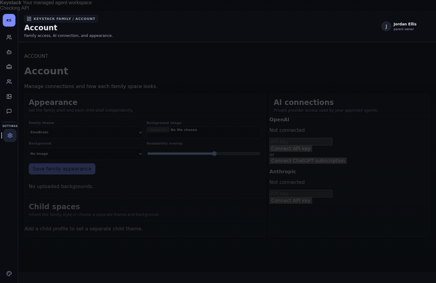
select, the API-key inputs, the slider) is dark-on-dark. The select and inputs have near-invisible borders and dark text on a dark field — you can't tell they're editable.--control-bg, --control-tx, --control-line that flip with theme; inputs/selects get a visible border + AA text in both themes. Add a visible :focus-visible ring (currently none).Catalogue — only the agent photos survive
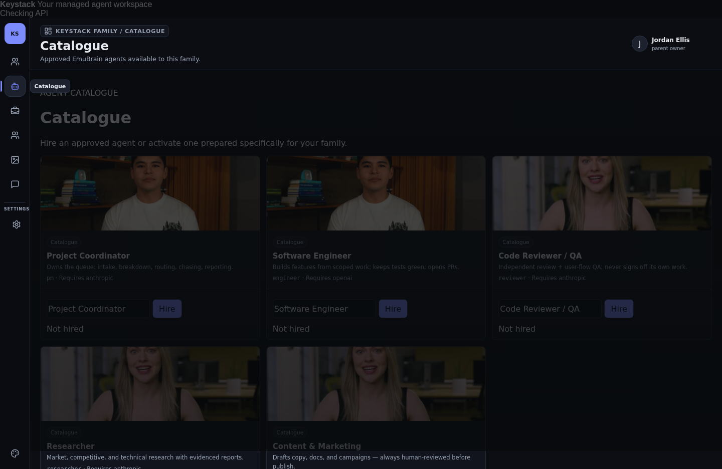
--surface/--surface-2; the "Hire" button becomes a real primary in both themes; the name field gets --control-*.Chat — a full agent video plays with no agent selected
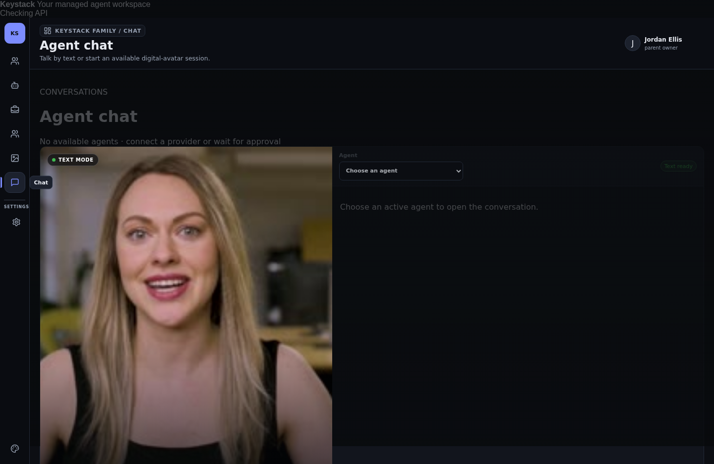
Header: cramped to the edge + a status that never resolves
Sign-in (the one light screen) — duplicate "Log in" & three button colours
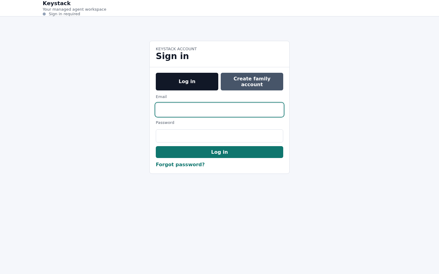
.btn + .btn--primary/.btn--ghost variants driven by tokens; add one consistent :focus-visible style; give the header its gutter.Positional colour with no meaning + no interaction polish
Fix plan — order for Rafi
Ship in this order (keystack-web)
- 1 · The theme colour contract (P0). Define a full light+dark token set (
--tx,--tx-muted,--surface,--surface-2,--line,--control-bg/-tx/-line,--btn-*); make the "EmuBrain"/dark theme redefine all of them; route every component through tokens; verify AA (4.5:1) on both themes. Make the "Readability overlay" enforce a contrast floor. This alone clears the "ugly" across every surface. - 2 · Header container + status. Add the missing gutter/max-width wrapper; resolve "Checking API" to a real Live/Degraded state with a semantic dot.
- 3 · Controls & buttons. One
.btnsystem with primary/ghost variants +:focus-visible+ hover; tokenised inputs/selects with visible borders. - 4 · Chat empty state. Don't render the avatar video until an agent is active; show a picker/placeholder.
- 5 · Sign-in polish. Rename the toggle to Sign in / Create account, one primary submit, unified buttons, header gutter.
- 6 · Housekeeping. Drop positional card borders; add interaction transitions.
I can turn #1 into an exact token table + before/after mock (same as the Catalogue spec) and pair with you on the rollout — say the word. This audit is design-only; implementation is yours.
Keystack staging visual audit & fix plan · Sana → Lena / Rafi · 2026-07-24 · grounded by walking staging.keystack.com (CF Access + demo gate, family test account) across all authed surfaces. Evidence screenshots are real captures. No product code touched.